Philadelphia Food Delivery Data Visualization
This was my final project for my Data Visualization class during Fall 2020. We worked alongside a food delivery logistics client and leverage their data to provide insight and analysis on delivery cost efficiency using JavaScript and D3. Our theory was that most mature delivery restaurants lose money on their delivery orders. This is because of the premiums introduced by do-it-all delivery services like GrubHub or DoorDash. This project aims to leverage data that we get from our undisclosed partner in the logistics industry to provide insight and analysis on delivery cost efficiency. The goal is to enable restaurants to make better informed operational decisions that will be beneficial for maintaining profit margins in the delivery market. Restaurant owners do not necessarily have the time to dig into nuanced financial information, so our project is an attempt to provide insightful content at-a-glance. Based on our dataset of the Philadelphia delivery market, most restaurants have the ability to save significantly by outsourcing delivery to delivery-only logistics companies.
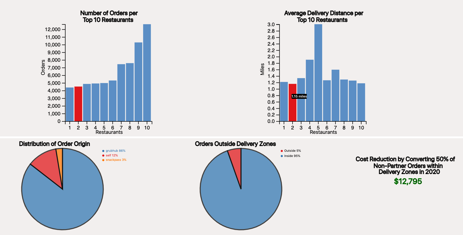
For the visualization design, we decided to implement two bar charts as well as two pie charts. The bar charts help visualize the top 10 restaurants and their related order volume data as well as their average distance (in miles) for all orders. We added hover-linking through both bar charts that will change the color of the hovered bar to show the relation between the two charts. It will also link the same restaurant data together between the two bar charts. There is also a tool-tip included for the user to find the specific order volume or average order distance for that specific restaurant when hovering. Given that information, we implemented details on demand pie charts for the bar the user ends up hovering over. The pie charts help distinguish the distribution of order origin (grubhub, snackpass, etc...) as well as the distribution of orders outside delivery zones for that specific restaurant. If no bars are hovered, then the pie charts represent data for all 10 restaurants, whereas, if a bar is hovered, only that specific restaurant data is shown. To elevate our project further, we decided to include a cost reduction aspect to our visualizations. The cost reduction/saving represents the 20% premium restaurants pay for competitors to provide logistics. The number shown is what restaurants can save if they convert competitor orders to our partner company. In order to make our findings realistic, our cost savings calculation assumes that restaurants can convert 50% of competitor orders within our partner’s delivery zones to our partner. Similar to the pie chart, the cost savings is a detail on demand where if no restaurant bar is hovered, it represents total cost savings by all 10 restaurants.
Link to GitHub Repo and GitHub Webpage
